Photography debate stirred by new Henri Cartier-Bresson exhibition
black and white photography black-and-white color photography henri cartier-bresson historical photography
by Steve Meltzer
posted Friday, November 9, 2012
A new gallery exhibition at Somerset House in London that runs through January 27, 2013, bears the provocative title "Cartier-Bresson, A Question of Colour." The show presents 15 rarely seen black-and-white photos by famed French photographer Henri Cartier-Bresson alongside 75 color prints by 15 noted photographers from Europe and North America.
What is the "Question of Color," you ask? Well, Cartier-Bresson -- or HCB as I sometimes call him -- was a master of black-and-white images who openly disparaged color photography, primarily because of its technical and aesthetic limitations at the time (the 1950s). However, the color photographers featured in this show all claim HCB as one of their prime influences. Therein lies the contrast, the conflict, the "Question of Colour."
HCB did indeed shoot
in color, but was so unsatisfied with the results that he never shared
them. The color photographers featured in this exhibition are all very
talented, and you could say they shoot in a Cartier-Bresson "style"
though that does them a disservice. While -- like so many of us -- they
have clearly learned from HCB, they have moved on to find their own directions.
Consequently, many of the photos in the show are nothing like HCB's images,
though they are all great photos.
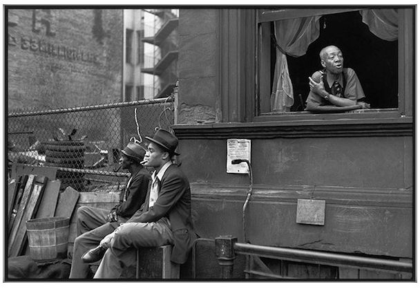
Harlem, New York,
1947
Henri Cartier-Bresson
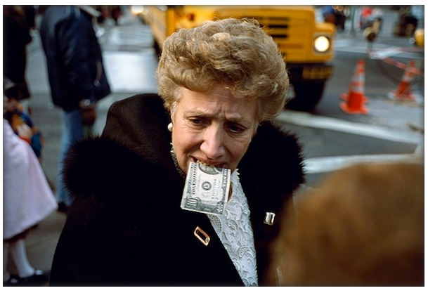
Untitled ($10 bill
in mouth), New York City, 1992
Jeff Mermelstein
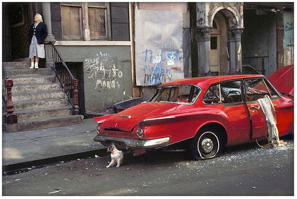
Cat Next to Red Car,
New York, 1973
Helen Levitt
One thing I think
the exhibition demonstrates, perhaps a bit unconsciously, is that often
color overpowers content. In almost every image, color catches our eyes
first, disrupting the delicate balance between the decisive moment and
the geometry that were quintessential to HCB's work. In a black-and-white
image, without the distraction of color, we see the subject and its context
more directly and can connect with the photographer’s intent more
easily.
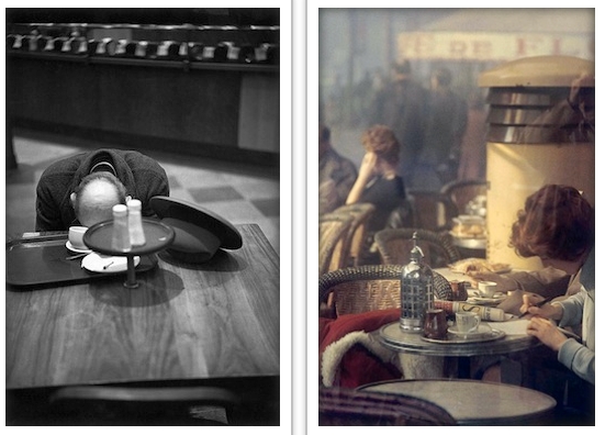
Brooklyn, New York, 1947
Henri Cartier-Bresson
Saul Leiter
In the late 1960s, color TVs became widely available stateside, and soon the Ed Sullivan show and news of the Vietnam War came into homes in a peacock’s tail full of color. At the same time, the exuberance of "flower power" and psychedelics made the whole world burst with rainbow brilliance. Audiences and clients alike demanded color in all their media. Meanwhile, black-and-white images were shuffled off to the realm of galleries and museums.
As a young photographer, I studied and worked with many of HCB’s generation. These were photographers who were part of the inner circle of Magnum and friends of HCB. They struggled with the black-and-white versus color issue, too. However, few simply chose either/or; that just wasn’t how most thought about their craft. Many experimented with the possibilities offered by a lightweight, multi-lensed, Leica or Nikon loaded with Kodachrome or Fujichrome film. Some fully embraced color, including Pete Turner, Ernst Haas and Marc Rimbaud.
What I learned from them, and I believe is important, is the idea that color is not a question but rather an answer. You don’t try to shoot around color. You shoot with it. Then you add the decisive moment and geometry. Because color so dominates the image, you have to embrace it.
It is a pleasure for me that these rarely shown HCB photos and the color work of the other 15 photographers are all getting a chance to be seen by the public. Despite the show's premise, to me there really isn't a need to stir up a debate about black-and-white versus color photography. As modern photographers, we are all free to shoot in black-and-white or color. Both have their pros and cons. I'm simply happy when I take a good photograph.
What do you think about the color vs black-and-white issue? Is color as often a distraction as a positive element in your own work? Do you shoot one, the other, or both? When and why do you choose black-and-white?
Steve Jacob • a year ago
The "accident" of early photography was that colour was not available at all, so people exploited the tonality of B&W to effect and we "grew up with it" and learned to accept its advantages as well as it's shortfalls. But it was virtue born of necessity. To try and confer some blanket artistic benefit to a constraint which no longer exist seems retrogressive. Artists using oils in the 19th century had no such qualms about colour after all.
To me, digital images converted to black and white look as if they are trying to be "arty" by emulating some "accepted norm" for a certain type of image, but its a cop out, retro pastiche, a contrivance. Black and white is wonderful for creating a mood, when that mood is appropriate, but its emotional palate is limited when it's not. It can work, and work brilliantly for the reasons you described, but in many more instances it's a dreary failure.
Colour imparts so many subconscious messages that history seems dull without it - both literally and figuratively. Looking at old street photos I miss the details - the colour of peoples clothes, streetcars, houses, store signs and shop fronts - which are so much an integral part of the history and the time. My grandmother hated photos of her childhood. She used to think it made everything look glum and dreary and serious when it was in fact quite the opposite - life used to be far MORE colourful if anything, but that's completely lost to us.
So let's admire old masters, but let's also move on. You don't have
to let colour control the image - it's part of the compositional process
- you can manipulate it. Colour can actually create contrast in situations
where tonality is actually flat. But the colour tones and palate you choose
is now entirely up to you. You are no longer controlled by your emulsions!!