By Chris
Rutter It
is easy to take color for granted; after all, it is how
we see the world every day. But color plays such an integral
part in our emotions and in our perception of a scene that
knowledge of the nature of color and how to capture it in
your images will give impact and expression to your photography.
The
difference between these two images is simple: one is mainly orange
and one mainly blue. However, the difference in the overall
feel of the two is marked. The orange image is welcoming and warm.
In the blue image, the whole scene looks cold and uninviting. Why
these colors cause such differing emotions is largely psychological.
The ability to measure the color differences and manipulate them
allows us to capture more than a simple representation of a scene;
it allows us to create a more personal view of the world.
It
is easy for us to identify the colors of this image as wrong, but
what has caused the color cast and how do you eliminate it? Without
some knowledge of how colors appear and basic color theory, it would
take far more trial and error to find a solution than is necessary.
This is why it is important for photographers to learn something
about how colors work before embarking on the more creative aspects
of color photography.
Painters
and designers learn how color can be used to their advantage
at a very early stage, but for most photographers learning about
this issue is often a question of trial and error. Traditionally,
this has been because photography did not offer the same artistic
license as other visual media. Simply capturing the world around
them meant that there seemed little point in photographers learning
how to mix colors and use color contrasts. However, digital photography
has opened up a whole new world of creative possibilities, by
offering everyone the opportunity to create their own vision of
the world around them, including the ability to adjust or even
to change colors.
Traditionalists
may not hold with this level of manipulation, but does anyone
object to black-and-white photography? That is surely the greatest
manipulation of all, and it has been at the heart of photography
since its very beginning. Even capturing images on color film
is not a pure recording medium. Film does not see light in the
same way as we do; as soon as you press the shutter you are manipulating
reality, so make the most of it and use color to your advantage.
Knowing how
to use color effectively will expand your creativity and your
awareness of why some images work while others fall flat. It is
also valuable to know about the more technical aspects of the
subject: color accuracy and knowledge of light sources will make
it easier for you to capture the image accurately in camera. This
mixture of artistic and technical aspects lies at the heart of
photography. Concentrating solely on the technical factors of
your imagesthe exposure, sharpness, and so oncan result
in dull and contrived images. But without some technical knowledge,
you will struggle to get the most from your photography. This
is especially true of color and how you use it effectively in
your images. If you concentrate solely on getting the color technically
correct, you will miss out on a whole world of images.
You need
to be able to spot the potential of the colors in a scene and
then use them in your images. This process starts long before
you even pick up the camera; it involves how you see colors and
how they influence our perception of the world. Honing these skills,
along with the ability to capture them to recreate the impact
they had on you at the time, is the key to producing great color
photographs.
Even when
you don't have your camera with you, keep your eye in by looking
at the scenes around you. You will soon see how many of the
things we take for granted use the same color principles that
you can use in your photography. This includes how nature uses
color to attract or deter other creatures, and how designers and
architects use color to create an emotional reaction when we use
their products or buildings.
Be aware that,
for all our knowledge and technology, there are still aspects
of color and light that we do not fully understand. Even the way
that we actually see colors is a mystery; although the basic physical
aspects are known, how our brains interpret the information gathered
by our eyes is still open to much speculation. For me, that is
what makes color photography such an interesting medium. Color
has the power to create moods, evoke emotions, or show the world
in ways that would otherwise be invisible or lost to our everyday
lives. By carefully selecting, adjusting, or manipulating the
colors present in an image, it can be given a meaning that can
be as blatant or as subtle as you like. Before we get started
on the photographic aspects of color, we need to find out what
color is and why we react to colors differently. In this article
we will investigate the basics of color theory, along with the
science behind our vision, and how we have tried to quantify and
categorize colors. It is, of course, possible to explore the creative
use of color without this groundwork. But with more and more photographers
taking control of the whole imagemaking process, from capture
through to printing, the need for an understanding of how and
why colors appear as they do is becoming more important. So
let's see why colors look the way they do.
What Is Color?
As long ago
as the 6th-century in China, people have tried to understand how
and why we react to different colors and how the various colors
work together. This ongoing study has produced many theories about
the nature of color, all with a similar theme at their heart.
Color theory
is based around the existence of three colors that, when mixed
together, can produce all other colors. These colors, known as
the primary colors, vary according to their application. As photographers,
we are mainly concerned with the properties of light, so that
is what we will concentrate on here.
Summary
of the Uses of Primary Colors
With three different combinations of primary colors, it can be
confusing as to which should be used. Here are the technical uses
for each.
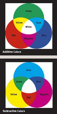
Additive
Red, green, and blue (RGB): light, digital cameras, and displays
Subtractive
Cyan, magenta, and yellow (CMY): commercial printing and some
home printers
Yellow, red, and blue (YRB): painting and art theory
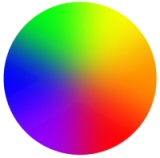
Additive
Color
The three primary colors of light are red, green,
and blue (RGB). Combinations of these building blocks
can be used to produce all of the colors in the visible
spectrum, and equal amounts of all three produce white
light. Because these colors are added together to
make white, they are known as additive primaries.
Mixing equal amounts of two primary colors together
produces what are known as the secondary colors. These
are: yellow (red + green); cyan (green + blue); and
magenta (blue + red). The easiest way to visualize
these relationships is using a diagram known as a
color wheel.
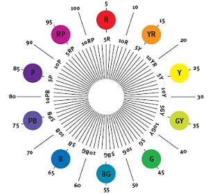
By
placing the different colors around a circle you can
see how the colors work, and how they influence each
other. The primary colors are equally placed around
the wheel, with the secondary colors placed between
the two colors that, when combined, make that color.
The
colors that are next to each other on the color wheel
are known as harmonious or analogous colors. This
is because when you see them together they give a
sense of calm and peace, or harmony. Colors opposite
each other on the color wheel create the maximum contrast
and are known as complementary colors. When viewed
together, these colors can clash, creating a striking
image. These two relationships between colors lie
at the heart of color theory. Color theory has been
used by both scientists and artists for centuries,
allowing them to categorize colors, or exploit them
for visual effect.
Subtractive
Color
Unfortunately, the red, green, and blue additive primaries
do not apply to every situation. To explain how printing
inks produce different colors, you have to consider
a different set of primary colors: cyan, magenta,
and yellow (CMY). When combined in equal amounts,
these three colors produce black, and are known as
subtractive primaries (in printing, these colors are
known as CMYK; the K stands for black to avoid
confusion with blue, although originally K stood
for key plate ). If you look at the color wheel
diagram, you will see that this is simply a reversal
of the primary and secondary colors.
Because
cyan and magenta are not often encountered in their
pure form in nature, subtractive color is best considered
as a technical aspect of printing, rather than as
a color theory for explaining color combinations.
We will investigate it further when we discuss the
process of color printing.
Another
set of subtractive primary colors is yellow, red,
and blue (YRB). This system is based on pigments and
is therefore of most importance to painters. These
three colors are those that aren t created by mixing
any other colors, so are the primary colors. This
produces a color wheel that varies slightly to the
RGB model. But the colors are essentially in the same
order around the wheel. So, despite the differences,
you can apply both in a similar way.
Despite being the same color saturation and intensity, the yellow
swatch appears much brighter than the blue next to it. This discrepancy
in our color vision plays a large part in how we react to certain
colors in an image.
Which
Color Theory is Best to Use?
As photography is concerned with the action of light, it is easiest
to concentrate on using RGB as the primary colors. While there
are differences between the relationships of the color in this
and the YRB primaries, they both use colors in the same basic
order on their respective color wheels. So neither is necessarily
best to use, just more convenient.
Color
Intensity
While the basic theory of primary and secondary colors is useful
as a starting point, it does not fully explain how the colors
work together. In this model, all the colors are presumed to be
perceived equally. Unfortunately, our vision is not a precise
instrument and we see colors differently, even though they have
equal intensity.
For example,
we generally perceive blue and green tones as being much darker
than reds or yellows of the same intensity. This perception is
partly physical, but is also due to the world around us. In nature,
most blue and green objects, such as a clear sky or foliage, are
non-threatening, so we don t need to pay so much attention to
them. Red and yellow are more often encountered with objects that
we need to pay attention toblood or dangerous animals, for
exampleso we are accustomed to perceiving these colors as brighter
and more eye-catching. These reactions mean that if we see an
image with equal amounts of two primary colorsfor example,
red and bluethe red appears much stronger and more prominent.
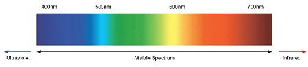
Light
Much of our knowledge about light derives from experiments that
the scientist Sir Isaac Newton (1643 1727) carried out in the
17th century. He demonstrated that daylight can be split into
a series of colors. This sequence of colorsred, orange, yellow,
green, blue, indigo, and violetis known as the chromatic color
sequence. Colors that are not part of this sequence, such as beige
or burgundy, are known as nonchromatic colors.
The nature
of light itself is still the subject of much speculation. Current
theories explain light by giving it the properties of both waves
and particles. We will deal primarily with the wave theory; this
explains the aspects of light, such as wavelength and frequency,
that concern us in color photography.
Light
Waves
The easiest
way to understand light waves is to imagine holding a string that
is fixed in position at the other end. By vibrating this string,
you create waves traveling along it. The faster you vibrate it,
the narrower the distance between the crest of each wave. The slower
you vibrate it, the longer this distance. This spacing between the
points is known as the wavelength.
It is this
difference that creates the different colors within the spectrum.
The brightness of the light is due to the amount of energy produced
by the light source. While this has an influence on photography,
it does not directly affect the colors produced.
Light waves
are the visible part of a much larger group of waves known as
the electromagnetic spectrum, which includes X-rays and radio
waves. The range that is present in daylight is shown below.
This ranges from the short-wavelength ultraviolet to the longer-wavelength
infrared, with the visible portion in between.
While our
eyes cannot see ultraviolet or infrared radiation, these can have
an effect on the image produced by both digital sensors and film.
In most circumstances, it is undesirable for the image to register
radiation outside of the visible spectrum. However, it is useful
for both scientific and artistic applications for producing images
of a world beyond our visible experience.
Why Objects
Appear� Colored
When we see
an object lit by white light, its color is due to the object absorbing
some colors and reflecting (or transmitting) others. For example,
green foliage appears to be green because it contains pigments
that absorb blue and red light and reflect only green light. It
is a similar story when the light is viewed through an object,
such as a photographic filter. You only see the part of the spectrum
that is allowed through. For example, a blue filter blocks red
and green light, and allows only the blue part of the spectrum
through.
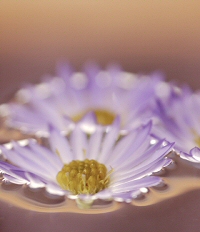
Measuring
Colors
Human
vision is very good at recognizing the differences between two
colors seen side by side. However, it is a different story when
it comes to accurately describing individual colors to someone
else. Accurate color classification is an important aspect in
color-management systems, which we discuss in detail later.
As an example,
look at the colors of the flowers and background in the image
below and try to accurately describe the two colors. Without being
able to relate each to another color, you will struggle. You can
say that the flowers are purple, or magenta, but it is almost
impossible to relate that to someone who hasn t seen the color,
even if they have a selection of colors to choose from.
There is also
the matter of personal interpretation of different hues; as we
will see in the section on how we see color, each individual has
their own idea of what colors should look like. So, even if you
have perfect vision, you cannot quantify the colors that you see
without comparing one to another, and even this is open to massive
differences in our interpretation of the color.
Describing
Colors
Even
though we can see colors accurately, it is very difficult to describe
them without a reference point to relate them to. That is what color
measurement is designed to do.
To
accurately describe colors for color matching, especially
when we delve into the world of digital imaging and
color management, we need a more reliable method. In
order to describe a specific color, we need to break
it down into three elements:
Hue:
the name given to the color itself. This is defined
by the name given to the main wavelength contained
within the color, such as blue, green, magenta,
and so on.
Saturation
(or chroma): the purity of the color. In many
instances, especially in print or pigments, mixing
black, gray, or white to a color will result in
lower saturation.
Luminance:
the brightness of the color. In pigments or print,
this describes how much incident light the color
reflects; in the case of a light source, it describes
how much light is emitted.
By using these three measurements, any color can be
described so that it can then be recreated accurately
throughout an imaging system. An understanding of
these measurements will help you to understand the
relationships between the colors in the scene that
you are photographing and how these will be reproduced
in the final image.
There
are two main systems used to define colors and give
them a specific numerical value:
The Munsell System
Originally developed by American artist A. H. Munsell
(1858 1918), this system, shown at right, was designed
to classify standards for printing inks, color pigments,
and artists paints. It uses a collection of color
charts made up of printed color swatches for each hue.
Each color is assigned a number to define the hue (the
chart that it appears on). Further values for luminance
and saturation give vertical and horizontal coordinates
to indicate where it appears on this chart. Therefore,
as long as you have these three values, you can find
the color on the Munsell chart and use it to ensure
that it remains constant throughout an imaging system.
Because
it is based on the pigments and inks available for
printing, the Munsell system has only a limited use
for photography. It cannot define many of the colors
that you will come across in many situationsfor
example, the colors produced by a light source, or
substances that have no direct pigment equivalent,
such as fluorescent, or the phosphers used to produce
the image on a computer screen.
However,
the Munsell system is still in common use in the printing
industry and some areas of graphic design; if you
are producing images for magazines, you may come across
this system for defining the colors that they are
able to produce.
The CIE System
The CIE system is much more suited to classifying color
in photography. It is usually shown in the form of a
chromaticity diagram (see diagram). It classifies colors
by equating them to the quantity of red, green, and
blue light that need to be mixed together to produce
a color. This is shown graphically so that every color
that it is possible to define can be placed by defining
its X and Y values.Because it is based on the mixture
of red, green, and blue light that forms the basis for
most digital imaging, this system has become the standard
for digital photography. This makes it the most suitable
system for defining the colors in color-management systems.
Why
Do We Need Color-classification Systems?
When we photograph a scene, we will come across a huge range
of colors and tones. Color-classification systems mean that
it is possible to predict how these colors will be reproduced
by each device that you use to produce the final image.
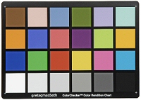
The Gretag
Macbeth ColorChecker is the most commonly used standard for producing
accurate results.
As a photographer,
knowing how your camera, computer monitor, and printer will cope
with the colors it encounters will help you produce the image
that you visualized at the time. Knowing, for example, that your
printer will struggle to reproduce the greens in the original
scene means that you can try to adjust how you shoot the scene
in the first place so you won't be disappointed in the final image.
Viewing
Because the color that we see is affected by the color of the
light falling on it, any color classification based on color swatches
relies on a standard light source for viewing. To accurately assess
any color in a print, you need to view it under the right lighting.
The most common type of light is known as standard daylight, and
specialized viewing booths used in commercial printing use lights
designed to produce a very accurate color. These booths are beyond
the means of most photographers, but you can buy daylight bulbs
relatively cheaply that are accurate enough for all but the most
critical uses. Try to set aside an area of your workspace that
doesn't contain any strong colors for you to accurately assess
the colors of your prints.
Your
attention is immediately drawn to the red car in this image, despite
the fact that it occupies only a small area of the frame. This is
due to many factors, one of which is the fact that red is associated
with danger. Consequently, we pay more attention to red than to
the colors around it.
How We
See Color
Trying to understand
how color is recorded photographically without knowing how we
see color is like trying to cook a meal without ever tasting food.
While photographic materials record colors in a predictable and
measurable way, it is how we see and react to both the original
scene and the final results that makes or breaks the process.
While you
may think that you see colors with your eyes, it is actually the
brain's interpretation of the information that determines what
we see. This can be influenced by personal and cultural factors
(certain colors have specific meanings in different countries,
for example). Despite these variable factors, there are also many
deep-rooted reactions that seem to be almost universal, and these
can be exploited in your photography.
Physical
Aspects of� Vision
Let's discuss some basic physical aspects of vision before describing
how we use this information. As we have seen, light is made up from
three primary colors red, green, and blue and this is basically
how our eyes see color. The light-sensitive cells within the eye
are split into two main types: rod-shaped and cone-shaped. The rods
are the most sensitive to light, but cannot discriminate between
different colors. The cones are less sensitive to light, but contain
chemicals that allow them to see one of the three primary colors.
The blue- and green-sensitive rods equate very well to the colors
that we think of as pure primary colors, but the rods that we use
to see red light are only sensitive to light that we would consider
to be orange. The information given by these three types of rod
is sent to our brain, which interprets the information to give us
a mental picture of the scene. So, while our eyes play a major part
in the physical aspects of vision, it is our brain that determines
what we see.
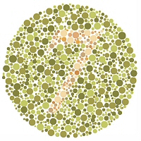
Color blindness test chart.
Limitations
of Color�Vision
There are many factors that mean that the colors seen
by one person may not match those seen by another. Here
are the most common problems to bear in mind when trying
to assess color correctly.
Color blindness: As opposed to the psychological influences
that mean we all interpret colors differently, color blindness is
a physical aspect of the reaction within the eye. This can take
the form of a slightly uneven response to the three primary colors,
or can result in an inability to distinguish between red and green.
Color blindness affects around one tenth of the male population,
but is much less common in females. At its most severe, color blindness
can cause problems with achieving accurate color balance, so it
is worth checking out whether you suffer from this condition by
using some of the charts readily available, or asking your optician.
Color
memory: The human mind can be lazy at times; rather than
making the effort of analyzing what we see, it often makes up information
because it is easier to do so. If we see an object that we know
should be a particular color, then the brain tells us that s what
we are in fact seeing. For example, when you see a picture of a
blue sky, your brain doesn t necessarily see the actual color, because
you already know what color a blue sky should be. On the other hand,
we take far more notice of the precise color of other objects, such
as food or skin, because these are areas that, historically, we
need to see precisely.
Brightness
and adaptation: Like the aperture of a lens,
our eyes have an iris to govern the amount of light
allowed through. In dark conditions, once the iris
is fully opened, the eye increases its sensitivity
to allow us to still see. This extra sensitivity
is controlled by the rod-shaped cells within the eye,
so we get less and less information from the color-sensitive
cone-shaped cells. As the light levels drop, our sensitivity
to color shifts more toward the blue-green end of
the spectrum, until there is no color information
at all.
This
adaptation is also partly responsible for our ability
to correct different light sources. When you move
quickly from an area lit by daylight to an indoor
situation lit by incandescent light, the scene will
appear much more yellow. After a short while in this
lighting, your vision will adapt, making the scene
appear more neutral. Neither digital nor film cameras
and materials react to light this way, so have to
be adjusted to give a result closer to our vision.
Color
fatigue: Our perception of an individual
color can be affected by the color(s) surrounding
it. This is partly a psychological reaction, but it
is also due to the receptors in the eye becoming fatigued
and influencing what you see. For example, if you
place two identically colored objects against two
differently colored backgrounds, the color of the
object will often appear to be different.
Despite all these
limitations, our vision is still remarkably good at assessing the world
around us and how it can be captured photographically. The more you
learn to see the world around you, the more likely you are to be able
to interpret color correctly and translate that into your photographs.