Archival Processing
(Some
information paraphrased from Carson Graves' The Elements of Black and White
Printing, Boston: Focal Press,
1993. See this text for more
thorough descriptions of these techniques.)
Before
you start:
Photographs
are fragile. This is an indisputable
fact of the medium in which you have chosen to work. Attempts to simplify the processes and procedures of processing
prints for permanence usually, eventually, result in disappointment. If you are printing work for a portfolio
or for exhibition or sale, you have little choice but to approach the process
with rigor and patience. There
may be much about the way you used to process prints that you will have to
≥un-learn≤.
Things
to keep in mind:
Always
leave at least a 1≤ border around the entire print, and never trim this border. When and if contaminants attack the print,
it usually starts at the edges. With
a border youπll have a ≥safety zone≤ that could give you time to discover
and correct the contamination.
Avoid
toners (with the exception of selenium), hand coloring, or mounting processes
that will weaken or jeopardize the printπs permanence.
If a particular manipulation after printing is a necessary part of
your visual statement, you will be forced to weigh your options and decide
which is most important in the work:
permanence or the manipulation.
It makes little sense to archivally process work with which you are
not satisfied. Conversely, there
may be a tenable compromise to a manipulation you have come to regard as essential
to your process that will not threaten the life expectancy of the print.
Paper:
Fiber-based
papers are the only ones to take seriously for archival processing. Galleries, museums, and collectors donπt purchase RC prints
for a reason: they do not last
more than a few yearsãespecially when exhibited under bright lights.
To
date, you have probably only ever used Ilford or Kodak multi-contrast paper. There are, however, countless options at your disposal. RC and Fiber-based are the two paper bases
available. Whereas both are available
in a range of surfaces (glossy, matte, pearl, semi-matte, etc.), fiber comes
in different weights. These include:
single-wight, double-weight, and museum or premium weight (effectively
triple-weight). Tonal quality
also differs quite a bit from paper to paper.
Your standard Ilford papers are fairly cold-toned papers. Other brands and varieties have other
colors or tones. For example,
Kodak Polycontrast tends to be a warm reddish tone, while Agfa Brovira has
a cool bluish color. Forte makes
a warm-tone poly-contrast paper with a bright white paper base. Luminos makes a version of the same paper,
but with a cream-colored base. Also,
the ratio of chromium to bromide in the paperπs emulsion can make a huge difference
in what happens to the paperπs color when it is toned in selenium.
The overall print color can radically affect the way a print is read. It is, therefore, up to you to determine which paper (and what
size) is most appropriate to the meaning you wish to convey.
Developer:
Donπt
bother spending the time to process an image to archival standards if it isnπt
perfectly exposed and developed. You
must use fresh developer to produce a full range of tones from highlights
to shadows. Keep track of how many prints go through
the solution and change it as often as necessary, according to the manufacturerπs
specifications. (I usually cut
the manufacturerπs recommendation in halfãespecially Kodakπs.) In general, you can count on being able
to develop about 25 8 x 10≤ prints
in an 11 x 14≤ tray of developer at a depth of no less than 1.5≤. Remember: test strips count, too. Further, development times for different papers varies. Most fiber paper requires at least two
full minutes to be fully developed in the shadow areas. Some papers, such as Forte Elegance Polywarmtone
must be developed from 3 to 5 minutes for full effect. If you are coming in to the lab to process
archivally and the developer has been sitting out, dump it and re-mix.
Stop
Bath:
Stop
bath contains acetic acid which is used to neutralize the alkalinity of the
developer, thus ≥stopping≤ the development action.
Not only is it important to make sure that the stop bath is fresh to
maintain consistent development, but if the stop is weak the fixer must act
as the neutralizer. This will
cause unpredictable development and, usually, staining. Alsoãalways drain your prints well from one chemical bath to
the next to maintain freshness as long as possible.
Fixer:
Although
sodium thiosulfate is the basis of classic fixing formulas since photographyπs
invention, most ≥rapid fixers≤ today use ammonium thiosulfate, which works
much faster but is a bit harsher. The
most amazing thing about the process of fixing is that it is still not technically
completely understood. Most think
that fixer simply dissolves undeveloped silver from the paper.
This is only part of what happens.
The silver actually undergoes three separate and complex chemical changes
before it becomes silver disodium, which is water-soluble and is released
into the fix. Fixing a print would be easy if converting
the undeveloped silver to silver disodium were the only thing at stake.
Unfortunately, if you over-fix a print you lose highlight details. Further, residual fixer left in the print will slowly (sometimes
not-so-slowly) destroy the print.
Our
archival fixing process will go like this:
1.
Prepare two separate trays of working-strength non-hardening
fix.
2.
Fix the print in the first tray for exactly three
minutes.
3.
Rinse the print in a tray of water (you can use this
tray as a holding bath until you have several prints to agitate in the second
fixing bath). Empty and re-fill
the holding tray with fresh water every half hour.
4.
Transfer the print to the second fixing bath for exactly
three minutes.
Important:
always maintain constant, gentle agitation. Do not place the prints in the fix and move on to the next
print. This is not Photo 1.
Washing
Aid:
After
fixing, wash the print in 70∞ running water for at
least 5 minutes. This makes the
washing aidπs job much easier. Now
place the print in the wash aid (PermaWash) for a minimum of 2 minutes but
not more than 5. Agitate continuously
and do not leave a print unattended in this bath. PermaWash can stain if a print is left over 5 minutes. PermaWash is a formulation of salts that
promotes an ion exchange with the thiosulfate compounds to make them more
water-soluble. It does not replace
the final wash, but is a necessary prerequisite to it.
Final
Wash:
Hereπs
where we find out how serious you are.
There are two main variables that determine how long you must wash
a print for archival processing. They
are:
Water Temperature
The
warmer the water, the more effective (and therefore shorter) the final wash. Water that is too warm, however, will
damage the print. It can also
cause reticulation (excessive grain clumping) in paper and can even cause
the emulsion to separate from the paper base.
It is kinda cool to see, but it is a real drag if it is your work. Keep the temp between 68∞ and 80∞ for best results.
Water Flow
Most
people assume the greater the volume of water washing over the print, the
more effective the washing. Actually,
water passing over a print too quickly doesnπt allow sufficient time for the
residual chemicals to pass from the paper fibers into the wash solution. Therefore, you should aim for a flow rate that will allow the
container (in our case the Plexiglas archival washer) to fill completely every
five minutes. Best way to determine
this, obviously, is to empty it and time how long it takes to fill up.
Toning:
In
addition to producing a mild deepening of shadows and a more pleasant tone
(usually), selenium provides protection by coating the silver in the image
with a more stable metal, rendering it more archival.
To tone a print for permanence:
1.
Prepare two trays of half working-strength PermaWash.
2.
Add 40ml of toner concentrate per liter of solution
to the second tray.
3.
Agitate the print for 3 minutes in the first tray,
then transfer it to the second tray.
4.
Agitate the print in the second tray, watching very
carefully for the beginning of a color change in the shadows (warming). Donπt try this in the darkroom! You need a bright light directly over
the tray to make this evaluation. Pull
the print before the color change is more than you want.
5.
Wash in cool water.
Water hotter than 85∞
will completely remove the selenium.
6.
Air-dry the print on very clean fiberglass screens.
Heat will drastically alter the color of the selenium.
Drying:
The
saddest thing to watch is the student who will carefully, painstakingly process
their prints only to place them on contaminated drying screens or in a (gasp!)
blotter book. Prints should be gingerly squeegeed and
placed face down on screens that you are sure are completely clean
of fixer and other contaminates. Of course, in a communal facility such
as ours, the only way to know for sure if a screen is clean is to clean it
yourself. To clean a screen about
which you feel dubious, mix up a bucket of half-working strength PermaWash
and get a new sponge and go to it. Rinse
well with warm water and then dry the screen. Now youπre ready to place your precious
archival print on it to dry.
Handling
and Presentation:
Because
the oils in your skin can damage the print as much as anything, you should
always avoid touching the print surface.
If you must handle the print (i.e. for spotting or matting), you should
wear Kodak cotton gloves.
Never
mount a print that has been processed archivally.
There is no mounting method that you can afford that is truly archival.
Cold-mounting a sandwich of Sintra and Plexiglas, although technically
archival, still doesnπt really cut it.
Not only would it cost several hundred dollars per print, but if the
mounting substrate or superstrate is damaged, the print is ruined.
A properly hinge-matted print can be usually rescued even if the frame
and mat are damaged.
Carefully
select matboards to insure they are archival.
If it isnπt called museum board, it probably is not archival.
Museum board is 100% rag and does not contain harmful chemicals. It is always the same material throughout.
Laminated or colored boards are definitely not archival.
Check the edge to determine if it is the same material through-and-through.
Remember
never to let the print come into contact with any surfaces that could contain
contaminates. These include: photographic paper boxes (studentsπ favorite
storage container), tables in the lab, etc.
Signing
and Documentation:
Only
sign a print at the very bottom of the border and then only in a soft-lead
pencil. Best to only sign a print on the back.
The telltale mark of an amateur is a big flourish of a signature prominently
on the surface of a print. An
edition is usually signed on the bottom of the back like this:
Title,
Date
1/X
Signature |
Editions:
Once
you achieve a perfect final print, you may choose to make more than one so
that you donπt have to replicate the time-consuming process from scratch later. Printing several of the same final print
is called printing an ≥edition≤. One
of the benefits of photography is that an image can be reproduced an infinite
number of times. In terms of
value to the collector, this can be seen as a drawback. Printing a limited edition theoretically
reduces the number of times an image can be reproduced, thus raising its value
in the eyes of collectors. A photographer may, for instance, produce an edition of ten. Each photograph will have a number denoting
its place, chronologically, in the edition. 1/10 means that is the first print of 10 produced. 10/10 means that is the last print made
in the edition. Once a print
edition is sold out, there are no more copies of the photo, with the exception
of Artistπs Proofs and Work Prints.
This is where it gets a little confusing.
A print marked A/P means that, while it is not officially a part of
the edition, it is a final print of the same negative that is typically not
for sale (until the artist is long deadãat which time anything goes).
A print marked W/P is a print from the same negative made before the
final print was arrived at and may be slightly different from the edition
prints. A/P and W/P are typically
not worth as much as actual edition prints. The system is obviously based on a specific economic system
and on the art object as a commodity.
Not all photographers choose to work this way. Many artists produce photographs as part of a time and/or site-specific
installation and thus a one-of-a-kind piece. It is important to know about editions,
though, because if you ever get work accepted by a gallery (and you all, of
course, will), it will be information youπll be asked to provide. The most important thing to know about
edition prints, though, is that they must all be exactly the same. All dodging, burning, flashing, toning,
etc., must be consistent from print to print.
Storage:
Prints
can also be contaminated by acids and sulfur compounds found in most paper
products. Light Impressions is one of the
most trustworthy vendors of archival storage solutions.
Donπt place archival prints in a non-archival storage box. Never store archival prints with non-archivally processed prints.
Place archival acid-free slip-sheets between prints to be stacked if
they are signed to prevent the pencil marks from being transferred to the
surface of a facing print. Fit prints as tightly as possible in the
box to prevent them from slamming against the sides when transported. Donπt store mounted or matted prints with
un-mounted or un-matted ones.
Documentation:
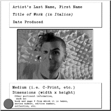
Always
make perfect slides of any print that represents a portfolio edition. Although there are varying conventions as to in what order
or according to what layout the information below appears on the slide labels,
it should all be included:
Users
of Microsoft Word 2001 for Mac and Word 2000 for Windows will find it helpful
to purchase Avery Return Address Labels #5267, as this format can be found
under "Envelopes and Labels", and the self-adhesive labels fit perfectly
on standard mounts. You can also find clear plastic labels, but don't bother
using these with an ink-jet printer, as the ink will smear badly.
Red
"carousel position indicator" dots can be purchased separately (Avery
makes them, too), or can actually be found pre-printed on some labels. You
can also just carefully make a dot with a fat-tipped permanent red marker.
This dot always goes in the lower left corner of the slide to indicate its
orientation for projecting. This means you should rotate all your slides so
that they appear the way you want them to (portrait or landscape orientation),
then place the dots. Many people mistakenly label an entire box of mounts
beforehand to save time. This is wicked silly, since you don't know until
the slide is mounted which way it is supposed to go.
Remember
not to label all copies of your dupes, as some galleries/graduate schools/grant
applications specifically do not accept adhesive labels (really cheap
ones tend to jam projectors). For these instances, you'll want an Ultra
Fine Sharpie permanent marker, a .05 Staedtler Pigment Liner,
or some other such pen (with pigment-based archival ink) and a very
steady hand. Never submit original slides. Especially for this project,
as I will not be returning those that you turn in to me. Similarly, a little
extra money spent on high-quality dupes is usualy worth it, and you should
never go more than one "generation", or remove, from the original
slide. It is not uncommon to gain a lot of contrast and grain and for color
to shift (subtly or drastically, depending on where you get them done) in
a duplicate, so you should never make dupes of dupes. If you find a
lab that makes duplicate slides that you are happy with--don't change. I recommend
Bokland Custom Visuals or McGreevy Photo
in Albany or Duggal Color Projects, Baboo, Spectra, or Hong
Color in NYC.
You
may also be asked to number your slides and provide a slide list. Leave some
space on the label for additional information to be added later. Much easier
than trying to get that tape goo off.
If
you expect your slides to be handled frequently (and I hope you do), or if
you must crop a slide before having dupes made, you will probably want to
replace those crappy cardboard mounts that tend to crop your image unpredictably
with high-quality plastic mounts. Many different types exist, but the cheapest
of acceptable quality that I know of are Pakon. Metallic slide-masking tape
(made by both 3M and Scotch) is available at most photo supply stores, or
from Light Impressions.
If you are presenting the slides in a clear polypropylene slide-page, be sure to label it, as well. It doesn't hurt to insure that your pages are all of the same type and configuration, and to replace them when they get torn, snagged, stained, etc.
Most
important of all: the image on the slide must be perfect. Slides are
still, unfortunately, the unofficial currency of the art world. They signify
your work. Arguments as to photography's relative veracity notwithstanding,
slides should resemble as closely as possible the work they stand for. Under-
or overexposed slides should be thrown out to discourage you from including
them in a last-minute package when you get low on dupes. You should strive
to make your slide look better than the work it documents. While this is usually
logically impossible, if you maintain very high standards in your documentation
you'll be better able to focus on stressing over some other excuse for being
rejected.